
Power BI Interview Questions
Scatter Charts: Find Trends & Outliers Easily
A scatter chart is a great way to visualize the relationship between two or more numerical variables. It helps find trends, patterns, clusters, and unusual data points (outliers).
What is a Scatter Chart?
It (also called a scatter diagram or XY chart) shows dots on a graph to represent data points.
- X-Axis: One numerical variable
- Y-Axis: Another numerical variable
- Dots: Each dot is a data point
If you add a third numerical variable, it becomes a bubble chart, where the size of the bubbles adds extra information.
Types of Correlation
Positive Correlation
As one variable increases, the other variable also increases.
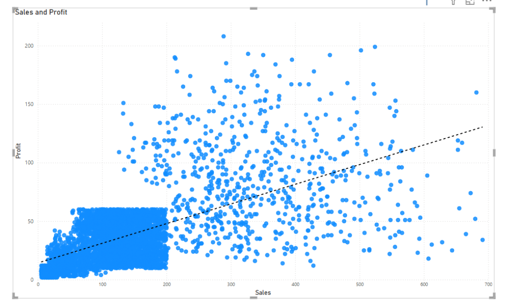
For Example – The graph show that Sale increases, Profit generally increases.
Negative Correlation
As one variable increases, the other decreases.

For Example- – The graph show that Profit is decreasing with increase in Sales.
No Correlation
The variables do not show any relationship.
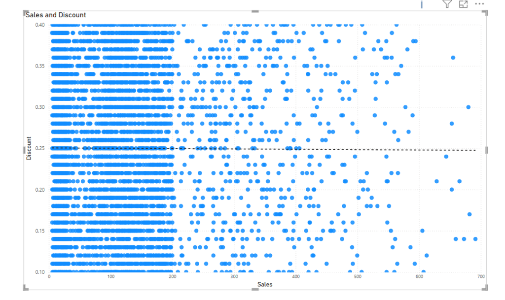
For Example- The graph shows no relationship between Sales and Discount.
How to Create a Scatter Chart in Power BI
Creating a scatter chart in Power BI is :
Select the Scatter Chart from the visualization pane.
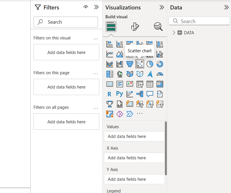
Drag and drop:
- A numerical field (Sales) to the X-axis
- Another numerical field (Discount) to the Y-axis
- Add a Category field (Product) to the Values
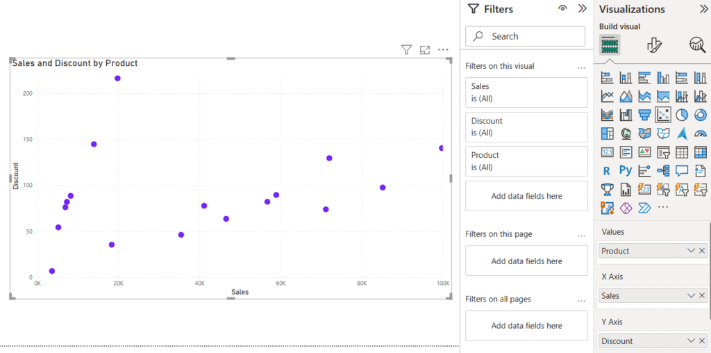
Real-World Use Cases of Scatter Chart
- HR Analytics: Comparing employee experience vs. salary.
- Retail Business: Analyzing foot traffic vs. total sales.
- Financial Analysis: Stock price vs. trading volume correlation.
- Marketing: Ad spend vs. customer acquisition.
- Manufacturing: Defect rate vs. production time.
Best Practices for UsingScatter Chart
- Use trendlines to highlight patterns in the data.
- Avoid overlapping points by enabling jittering (spreading dots slightly).
- Choose the right scale for better readability.
- Use colors & tooltips for better insights.
- Keep your data clean to avoid misleading interpretations.
Want to learn more about PowerBI ?
Add comment