
Power BI Interview Questions
Waterfall Chart : Easy way to visualize “Data Change”
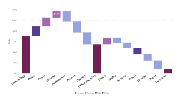
In Power BI, a waterfall chart is a data visualization that displays the cumulative effect of positive and negative values on a starting value, facilitating analysis and understanding of data changes.
Comparison between Waterfall Chart & Bar chart:
Waterfall charts emphasize the magnitude and direction of changes, making them suitable for trend analysis, while bar charts are effective at comparing values across categories.
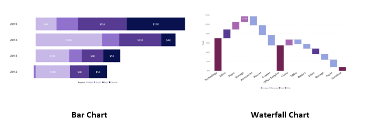
Waterfall charts display both positive and negative values, enabling easy identification of trends and contributions, while bar charts typically represent positive values only.
How to create a Waterfall Chart in Power BI?
>> Connect to your data source in Power BI and select the category and value fields you want to use.
>> Go to the “Visualizations” pane, choose the “Waterfall Chart” visualization, and drag the category field to the “Axis” area and the value field to the “Values” area.
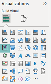
>> Customize your waterfall chart‘s appearance using the formatting options in the “Visualizations” pane, such as colors, data labels, and axis labels. Utilize filters and slicers in Power BI to interact and analyze your data from different perspectives.
Conclusion:
Waterfall charts are preferred over bar charts in Power BI when analyzing data with cumulative effects and examining the contribution of positive and negative values.
Waterfall charts excel in visualizing financial data, budget analysis, and showing the net change from one category to another. They effectively illustrate the flow and impact of values over time or categories.
On the other hand, bar charts are more suitable for comparing discrete values across different categories without emphasizing the cumulative effect.
If the focus is on individual values, bar charts are a better choice.
However, when understanding the cumulative impact and flow of values is crucial, waterfall charts offer a clearer representation.
Add comment